Every third-party script on stripe.com runs inside a sandboxed iframe served from b.stripecdn.com. Open the network tab on the main document and you'll find scripts loading from exactly two hosts. That is not an accident — it is the kind of decision a team makes when it has thought seriously about its own attack surface, and my audit found a dozen more decisions like it before it found the two that matter more.
Content-Security-Policy, HSTS, X-Frame-Options and nosniff ship on all six pages the audit checked. DMARC is set to p=reject; pct=100 — the strictest posture, no partial rollout. llms.txt is served at 64,986 bytes and all 12 AI crawlers the audit checked are allowed through. Zero of the 200 internal links the crawl followed were broken. Even the no-JavaScript version of the homepage still carries its title, meta description, H1 text and JSON-LD. This is expensive, deliberate engineering, and it's worth saying so before anything else.
None of that is what I keep coming back to. What I keep coming back to is /contact/sales — Stripe's sales-lead form — where the audit, run on August 5, 2026, found two critical defects sitting on top of each other: a keyboard trap built from forty-three invisible controls, and five buttons across the site with no name a screen reader can announce. The full report, with every finding, evidence shot and fix, is linked throughout below.
- The funnel with forty-three invisible controls
- Five buttons with nothing to say
- A pricing page shouting in headlines: 153 of them
- The Atlas orange, and ninety-eight more contrast failures
- Smaller trip-ups: tooltips, landmarks, and four axe rules
- Performance, ranked last on purpose
- Forty-three screens to the FAQ
- Mostly excellent SEO, with two gaps
- Two configuration slips nobody would notice by eye
- What I'd fix first
The funnel with forty-three invisible controls
/contact/sales is where a visitor becomes a sales lead, and it renders every step of that funnel into the DOM at once. The inactive steps are hidden with opacity: 0; pointer-events: none — nothing else. The audit counted 11 .ContactSalesFormStep.isHidden containers on the page and checked the computed styles on each: every one still resolves to visibility: visible, display: block, with no aria-hidden, no inert, and no hidden attribute anywhere on them.
Then it did the test that actually settles the question: it called .focus() on every control inside those hidden containers. Forty-three out of forty-three accepted it. Walking the page in document order, the eighth focusable element a keyboard user reaches is already an invisible Back button. Of the page's 53 focusable elements, 43 — 81% — belong to steps the visitor cannot see. Re-checked live again just now, the same 11 hidden containers are still there, still fully focusable.
Among the controls sitting in that invisible 81% are a marketingOptIn checkbox, a Submit button, an unsubscribe link, and headings for funnel states the visitor hasn't reached yet — "Thanks for your submission," "Your meeting is scheduled." pointer-events: none stops a mouse. It does nothing to Tab or Enter. A keyboard or screen-reader user filling in Stripe's primary sales-lead form gets two real fields, then a field of controls they cannot see or orient in — worst case, one they can toggle without knowing it exists. This is a keyboard and focus-order failure on the one page built to make Stripe money from people who aren't already customers.
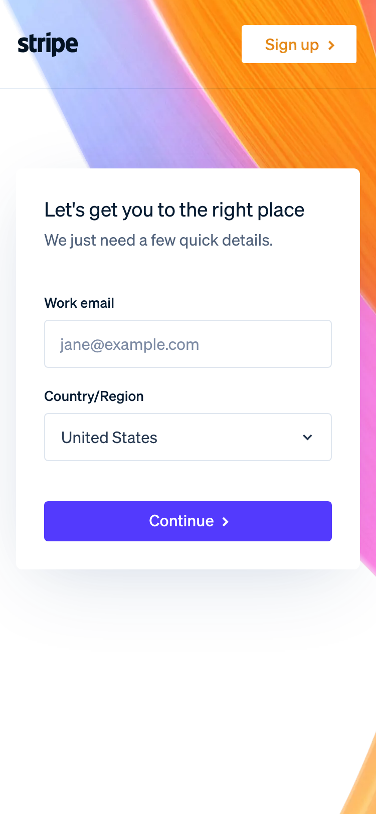
What makes this frustrating rather than just bad is that Stripe's own header does the fix correctly two clicks away. Its closed mega-menu is hidden with visibility: hidden, and the audit confirmed those links correctly refuse focus. The form step never got the same treatment:
/* current — hides pixels only */
.ContactSalesFormStep.isHidden {
  opacity: 0;
  pointer-events: none;
}

/* fix — removes the step from the tab order and the accessibility tree.
   visibility: hidden still animates, so the fade survives. */
.ContactSalesFormStep.isHidden {
  opacity: 0;
  pointer-events: none;
  visibility: hidden;
  transition: opacity .25s ease, visibility 0s linear .25s;
}
One declaration, plus inert set on the container by whatever controls step transitions. About 45 minutes including a keyboard pass to confirm it.
Five buttons with nothing to say
axe-core flags this one directly: button-name, critical impact, WCAG 4.1.2, on 5 elements across 3 of the six audited pages. The audit then found a sixth live instance the automated scan hadn't crawled to. Every one is an icon-only <button> with no aria-label, no title, no text node, and no <title> inside its SVG — a screen reader announces each of them as, simply, "button."
The costliest three sit back on /contact/sales: the close button on the call-booking modal, and the previous/next controls bound to daySelectorPreviousButton and daySelectorNextButton. Those arrows are the only way to change the week in Stripe's call-booking calendar. A screen-reader user cannot tell which direction either one moves — booking a sales call is not something they can finish without sighted help.
The other two are smaller but show the same pattern. .query-box__input-button is the submit control on /personalize — the audit confirmed it live as <button type="submit" ... disabled> wrapping a bare SVG arrow. The textarea next to it is labeled correctly (aria-label="Enter your company's URL..."); the button that submits it is not.
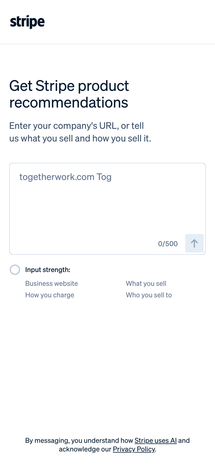
And .platform-graphic__replay-button — a 40×40 control that appears once the homepage's platform animation finishes — was caught by axe on /br. Scrolling the English homepage until its own animation finished turned up the identical unnamed button there too. That's not a Brazilian-Portuguese regression; it's one shared component, broken everywhere it's used. Five aria-label attributes fix all six instances:
<button type="button" data-js-target="CustomCallBooking.daySelectorPreviousButton"
        aria-label="Previous week"> … </button>
<button type="submit" class="hds-button query-box__input-button …"
        aria-label="Get recommendations"> … </button>
<button type="button" class="platform-graphic__replay-button"
        aria-label="Replay animation"> … </button>
Roughly 30 minutes, including localizing the two pt-BR strings. Add it to the CSS fix above and you clear both critical findings for about 1.25 hours of work — the full report calls this out as the single highest-leverage fix on the whole site.
A pricing page shouting in headlines: 153 of them
Fetch the server-rendered HTML of /pricing — what a crawler or screen reader actually receives — and it contains 153 <h1> elements, 4 <h2>, and 6 <h3>. /atlas has 36 H1s against 3 H2s. /contact/sales has 15 H1s against 4 H2s. Re-checked live today, the pattern still holds.
The cause is one shared component. Copy__title renders as <h1> no matter how deep it's nested — on /pricing alone it accounts for 125 of the 153 — and the site header's logo link is itself wrapped in <h1 class="SiteHeader__logo">Stripe logo</h1>. So the very first heading a screen-reader user meets on /pricing, /atlas and /contact/sales is "Stripe logo," and every heading after it — "Payments," "Cards and wallets," "$5.00 cap," "Products used" — announces at the identical level.
Navigating by heading is the standard way blind users skim a long page. On /pricing that navigation returns a flat list of 153 equally-weighted items with no way to tell a section header from a footnote. The page is 34,849px tall at 375px width (more on that below); the heading outline is the only structure it has, and right now it conveys nothing. Worth noting plainly: heading hierarchy isn't a rule the axe rulesets this audit ran actually check — the audit counted this directly in the delivered markup, not from an automated flag. And to give the other side its due: / and /br, built on Stripe's newer Next.js template, are unaffected — 2 H1s, 5 H2s, 25 H3s, a sane outline. This is a defect of the legacy Copy template family specifically, not the whole site.
The fix is a level prop, not a rewrite: give Copy__title an explicit heading-level prop defaulting to h2, let each page template promote exactly one instance to h1, and turn the header logo back into a plain <a aria-label="Stripe home">. Budget around 6 hours across the template change and a visual-regression pass, since some CSS may be keyed off the h1 selector.
The Atlas orange, and ninety-eight more contrast failures
/atlas sells company incorporation at a stated $500, with a $50,000 partner-discount package attached, and its brand accent fails WCAG contrast everywhere it touches text. axe's color-contrast rule flags 12 elements on the page as serious; a live scan found 41 elements rendering in that same orange, #ff7600.
The one that costs money is the page's own call to action. "Start your company," white text on #ff7600, measures 2.68:1 — the audit's fix-preview tool read this directly off the live page — against a 4.5:1 requirement for text this size and weight. It appears twice, once in the hero and again in the pricing section. The section captions ("Why Atlas," "Getting started with Atlas," "Pricing") and the Atlas / Guides / Perks / Docs sub-nav sit at 2.53:1.

Darkening the token to #C2410C — measured by the same tool at 5.18:1 on the button and 4.90:1 on the captions — clears both, while #ff7600 can stay for large decorative fills where no text sits on it, so the brand still reads as Atlas orange. That's a token change, not a per-component override: about an hour plus a visual sweep.
Beyond Atlas, axe reports 98 more elements below AA across the rest of the site: 74 on /pricing, 12 on /, 12 on /br. The /pricing failures land exactly where they hurt most — the qualifiers that change what a customer pays. #707f98 on #fafbfd, 3.91:1, 13px at weight 300, covers "+ 0.5% for manually entered cards," "+ 1.5% for international cards," "if currency conversion is required," and the "$5.00 cap." The section heading "Standard pricing for all products" sits at 4.44:1, just under the line.

On / and /br, the failures sit inside the homepage's animated Connect payment graphic — the site's main product demo. "Succeeded" status pills render at #108c3d on #d0eedb, 3.49:1 at 10px; the "save 25%" label and the "Pay $999.00" button both measure 4.03:1. Fee fine print and a live product demo are not places to lose contrast ratio — a prospect who can't read "+ 1.5% for international cards" finds out on their first invoice instead. Three token swaps handle most of it: #707f98 → #5C6B84 (5.21:1, measured), #635bff → #4F46E5 (5.95:1, measured), and roughly a 25% luminance drop — or a step up to 12px — on the payment graphic's status colors. About 1.5 hours of token work plus a re-scan.
Smaller trip-ups: tooltips, landmarks, and four axe rules
Three more findings, each real but each contained to a single component.
/pricing has 23 .TooltipButton controls explaining fee terms; 11 of them wrap an <a href> inside the <button> itself, which axe flags as nested-interactive. The nested links aren't decorative — they point at Stripe's actual subscription-and-cancellation-terms, tax-pricing, and Sigma cancellation pages, reached from the Billing, Tax, Sigma and Data Pipeline cards. A button containing a link produces one ambiguous accessible node; the link inside has no reliable way to receive focus. The fine print a buyer most needs before subscribing is, for keyboard users, stuck behind a control that can't expose it. /br carries one more instance of the same rule on a dom-graphic element. Fix: move the tooltip body out of the <button> into a sibling role="tooltip" element wired up with aria-describedby — one component change covers all 11, about 45 minutes.
Three of the six pages — /pricing, /atlas, /contact/sales — ship zero <main> landmarks, and none of the six ships a skip link. The audit confirmed the consequence live: three Tab presses from a fresh load of /pricing land on the header's logo link, with no bypass mechanism offered and, on those three pages, no landmark to jump to either. Credit where due: the header's own closed mega-menu is visibility: hidden and the audit confirmed its links correctly refuse focus, so the nav itself isn't bloating the tab order — the gap is specifically the missing skip link and landmark. This isn't something the WCAG rulesets this audit ran flag automatically; it was measured directly against the rendered page. Fix: wrap the content region in <main id="main-content" tabindex="-1"> and add a visually-hidden-until-focused skip link to the shared layout. About an hour, covering all six pages at once.
Four more axe rules fire once each, all serious, 6 elements total. scrollable-region-focusable hits the homepage's .bento-dialog-graphics on mobile and /atlas's .TestimonialCarousel__track at every viewport — both scroll sideways, neither is focusable, so the Atlas customer testimonials are simply unreachable without a mouse or touchscreen. list fires on .SignInList > .List__list on /pricing and /atlas, where <a> sits as a direct child of <ul> instead of inside an <li>, breaking the item count a screen reader announces. aria-hidden-focus fires on the /atlas hero <figure aria-hidden="true">, which still contains focusable content. aria-progressbar-name fires on the mobile /contact/sales progress bar — it has aria-valuenow but nothing telling a screen reader what it's the progress of. None of the four touches shared layout logic; budget about 45 minutes for all four together.
Performance, ranked last on purpose
Lighthouse, mobile, lab conditions: the homepage scores 46, /br scores 38. LCP is 4,759ms on / and 5,908ms on /br, against the 2,500ms "good" threshold. FCP is 3,709ms and 5,458ms. Total Blocking Time — main-thread work heavy enough that taps go unanswered — is 1,139ms and 1,162ms. Time to Interactive lands at 13,760ms and 15,812ms.
/pricing is the counter-example, and it matters because it shows the ceiling is reachable on this codebase: 85, LCP 3,127ms, TBT 165ms, TTI 6,215ms. Its one weak spot is server response — Lighthouse flags "Root document took 650ms" with 551ms of estimated savings, where / answers in 153ms from what should be the same infrastructure. Layout stability, meanwhile, is a genuine strength across all three: CLS measures 0 on / and /br, 0.000 on /pricing. For hero animations this complex, that's real engineering, not luck, and I want to say that plainly before the rest of this section.
I've ranked performance below the accessibility findings on purpose, and it's worth saying why: a 4.8-second hero costs some visitors some patience. A sales form a keyboard user cannot complete costs the lead outright. Both are worth fixing; only one is worth fixing first.
The /br numbers come from a single lab run, and lab runs vary — treat the 1,149ms gap between it and / as a reason to re-measure, not a settled fact. Both absolute numbers are far enough over threshold that the direction isn't in doubt, though.
Underneath the LCP numbers sits Lighthouse's unused-javascript audit: an estimated 273 KiB unused on the homepage (279,335 bytes) and 291 KiB on /br (298,140 bytes), out of 2,714 KiB and 2,828 KiB total page weight. Two files carry most of it. pages/_app-7923da34be0042d5.js is 359,126 bytes with 75,424 unused. pages/index-c4ba539719ca227f.js is 249,571 bytes with 116,465 unused — 47% of the homepage's own route bundle never executes on load. Two shared chunks add more on top: one ships 57,178 bytes with 50,378 unused, another 69,457 bytes with 37,068 unused. That's roughly 1.1 seconds of parse-and-compile a phone pays for code it never runs, and it lines up with the 1,139ms TBT above.
Images are the smaller share but the easiest win: a particles background image is served at 168,716 bytes with 82,435 wasted on over-sizing, a terminal graphic wastes 25,551 of 69,504 bytes, and a dot-map image is still a plain PNG — 32,266.5 bytes recoverable just by converting it to a modern format. Both homepage variants load the identical assets, so each fix counts twice. And 15 resources, all third-party marketing tags — a CloudFront tag script, a Zoominfo pixel, LinkedIn, Reddit, LiveRamp — fail the efficient-cache-policy check on every page measured. You don't control their cache headers, but you do control whether they load before the hero paints.
The order I'd tackle this in: split index-*.js so the below-the-fold bento and platform-graphic modules load on demand instead of up front, since that's where most of the 47% unused figure lives; fix the two images (114,701 bytes between them, benefiting both / and /br); then move the marketing-tag bundle behind requestIdleCallback so it stops competing with the hero for main-thread time. Call it 8 hours total, with the image work as the first easy hour of it.
Forty-three screens to the FAQ
During the audit, /pricing measured 34,849px tall at a 375px viewport — 42.9 phone screens — carrying 6,204 DOM elements. The top of the page works: the Standard card and its 2.9% + 30¢ headline rate are above the fold and read cleanly. The problem starts once you scroll past them. The first per-product price card, #payments, doesn't begin until y = 3,724px — about 4.6 screens down. #link follows at 6,465px, #payment-links at 8,006px, #checkout at 9,008px. The FAQ section doesn't start until y = 31,032px.
To Stripe's credit, the page isn't actually unnavigable — a sticky PricingStickyNav__fixedNav, a PricingSideNav, and a mobile PricingBottomSheetNav are all present and pinned to the viewport, so a visitor who notices one of them can jump straight to a product. The layout underneath is clean too: zero horizontal overflow, 32px of padding on both sides, nothing touching the edge.
The cost here isn't layout, it's orientation. Someone arriving from a Stripe Billing ad lands at the top of a 43-screen document and has to trust an easy-to-miss bottom sheet to find the one number they came for. Making that bottom-sheet nav visible on load rather than on scroll would fix the discovery problem directly, and it costs nothing structurally. The cheaper fix sits upstream of the page entirely: point paid and email traffic at the product anchors — /pricing#billing, /pricing#tax — so campaign visitors skip the 3,724px climb altogether. I'd also look at collapsing the per-product cards to a headline rate with a "see all fees" expander at mobile widths. Call it 2 hours for the nav visibility change and a campaign-link audit.
Mostly excellent SEO, with two gaps
Five of the six audited pages carry a properly branded title: "Stripe | Financial Infrastructure to Grow Your Revenue" (54 characters), "Stripe Atlas | Incorporate your startup in Delaware: C corp or LLC" (66), and similar for /contact/sales, /personalize, and the Brazilian homepage. /pricing is titled, in full, "Pricing & Fees" — 14 characters, no brand, no product name. That same string is also the og:title and twitter:title, so a link to Stripe's pricing page shared in Slack or iMessage previews as a bare "Pricing & Fees" with no indication of whose pricing it is — on the page fielding the site's highest-intent commercial search queries. A quick honest aside: / and /personalize share an identical meta description, but /personalize carries noindex, nofollow, so that duplicate costs nothing — I flag it only so nobody chases it as a bug. og:site_name is missing on all six pages, and /pricing and /atlas are additionally missing og:type and og:url. All fixable in the shared head partial: retitle /pricing, add og:site_name once, add the two missing tags to the two pages lacking them. About 15 minutes.
Structured data is the strongest showing in this whole audit, and it deserves the credit plainly: / and /br each carry a WebSite + Organization graph that goes well beyond the minimum — legal name, both founders marked up as Person, a contact point with five available languages, six office addresses with full postal data, and 12 sameAs links covering LinkedIn, Wikipedia, Crunchbase, GitHub, Wikidata and Bloomberg. /pricing ships a valid FAQPage block with 5 questions. Across the entire run, zero blocks were invalid. That's a hard thing done well, not a default nobody touched.
The gap is /atlas and /contact/sales, which ship no JSON-LD at all. /atlas is the more expensive miss — it's a named $500 product with a $50,000 partner-discount tier, and none of that is machine-readable as a Product, Service, or Offer. And no page on the site, across all six, carries a BreadcrumbList, despite /pricing and /atlas both sitting under a clear product hierarchy. Adding a Service + Offer + BreadcrumbList graph to /atlas, a ContactPage block to /contact/sales referencing the Organization node the homepage already defines, and emitting BreadcrumbList from the shared template going forward would close this. About 1.5 hours.
Two configuration slips nobody would notice by eye
Every load of the homepage throws 8 identical CORS failures, one per stylesheet, across mobile, tablet and desktop: Access to XMLHttpRequest at 'https://b.stripecdn.com/.../css/9d3a49263f73db6f.css' ... has been blocked by CORS policy: No 'Access-Control-Allow-Origin' header is present. They account for most of the homepage's 39 console messages and 54 failed requests. The audit isolated the cause directly: a no-cors fetch of that same stylesheet returns fine — an opaque response, meaning the file is served normally and nothing is visibly broken for a visitor. A cors-mode fetch of it is blocked. A cors-mode fetch of a JavaScript chunk from the exact same host and the same _next/static tree succeeds. The page's CSP already allowlists b.stripecdn.com, so CSP isn't the blocker — the CDN's response rule that attaches Access-Control-Allow-Origin was written to cover _next/static/chunks/ and never extended to _next/static/css/.
What it actually costs: Next.js prefetches route CSS via XHR so client-side navigation can paint instantly. Every one of those prefetches fails, so the stylesheet gets fetched again at navigation time instead — and the browser console becomes useless as a debugging surface for Stripe's own team, since these 8 errors fire on every single load. The fix is one CDN rule, broadened from _next/static/chunks/* to _next/static/*, plus a Vary: Origin header. About an hour including a cache purge.
The second slip sits in the CSP of the sandboxed tag iframe itself, not the main document. Stripe runs all its marketing tags inside GoogleTagManager.html, and that sandbox's img-src directive allowlists *.google.com — but CSP wildcards don't cross public suffixes, and Google's remarketing pixels redirect to a visitor's local Google domain. The audit reproduced this live: loading https://www.google.com.tr/pagead/1p-user-list/848119022/... throws "violates the following Content Security Policy directive... The action has been blocked," and the same block hit https://www.google.com.tr/ads/ga-audiences on all three viewports.
The specific ccTLD here depends on where the audit ran, so treat that detail as geo-dependent — but the underlying defect isn't. The allowlist contains zero Google country domains, not just the one that happened to get caught, so every visitor whose Google session resolves to a ccTLD hits this, which is most of the world outside the United States. Nothing breaks visibly; Google Ads remarketing audiences and GA audience lists just quietly under-collect for international traffic, and no dashboard tells you why. Adding Google's country domains to that one img-src directive, then confirming from a non-US vantage point, is about 30 minutes plus a verification pass.
What I'd fix first
Stripe's audit landed at 6.3 out of 10, and the shape of that number is the whole story: excellent platform engineering — the sandboxing, the strict DMARC, the clean crawler surface — pulled down by findings concentrated on the one page designed to generate revenue from strangers. If I only had an afternoon, I'd spend the first 1.25 hours on the two critical fixes together: visibility: hidden on .ContactSalesFormStep.isHidden, plus five aria-label attributes. That reopens the sales-lead form and the call-booking calendar to keyboard and screen-reader users in one pass, and it's the fix the full report leads with too. Everything else here — the 153 headings, the Atlas orange, the unused JavaScript, the CORS rule nobody's console has been clean of since it shipped — is real, worth fixing, and none of it is where I'd start.